The editorial language of Shiv Ganga
One quiet, confident system — hairline surfaces, restrained gold, a single lightweight motion runtime. Every token and component below is production code. Nothing here is a mockup.
Design principles
Quiet over loud
Hairlines and whitespace do the structural work. Shadows and colour are earned, never default. Gold appears once per view, as punctuation.
Editorial rhythm
A serif display against a humanist sans, generous measure, a strict vertical cadence. It should read like a travel journal, not a booking funnel.
Motion as luxury
One IntersectionObserver, one rAF loop. Content reveals on the way up the page; nothing bounces. Motion is GPU-only and fully reversible under reduced-motion.
Trust through candour
Specificity reads as honesty on a pilgrimage booking — a hut is called a hut. The type system exists to make plain facts legible, not to dress them up.
Server-first
Components render as static markup with data-attributes. The whole design layer costs almost no client JS, which is what keeps it fast on a Himalayan 3G connection.
Accessible by default
AA contrast, visible focus rings, reduced-motion and reduced-transparency fallbacks, and a no-JS safety net so content is never trapped behind an animation.
Colour
The palette is unchanged from the brand — deep navy for trust, sacred gold for devotion and calls to action, Himalayan teal as a cool secondary. Everything else is a derived ink or paper tone.
Brand
Ink scale · text
Paper · surfaces
Semantic · status
Typography
Playfair Display for editorial headlines, Plus Jakarta Sans for everything else. The scale is fluid — it breathes with the viewport using clamp().
Char Dham Yatra
Four shrines, one journey
Kedarnath & Badrinath
Overnight at Gaurikund
12,400+
The editorial lede sets the tone for a section — larger, looser, and held to a comfortable reading measure of about sixty characters.
Body copy runs at a relaxed line height for long-form legibility. It never exceeds sixty-eight characters wide, so the eye never loses its place across a line — the single most important typographic decision on a content-heavy site.
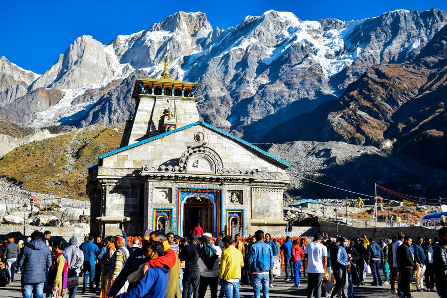
Photograph · Kedarnath temple at first light
A truly sacred passage
Spacing & rhythm
Component spacing runs on a 4px rhythm. Section spacing is separate and cinematic — a fluid clamp from 72px to 148px that gives every section room to breathe.
Grid
A single responsive grid primitive — 2, 3 or 4 columns that collapse to 2, then 1, at fixed breakpoints. Max content width 1320px, editorial reading measure 720px.
lux-grid--4
lux-grid--3
lux-grid--2
Radius & elevation
Corners stay nearly square — the editorial voice. Elevation is navy-tinted and used sparingly, only for surfaces that genuinely float.
Radius
Elevation
Glass & overlays
Frosted surfaces for sticky rails and the booking bar, over a gradient scrim for text-over-image. Both degrade to opaque fallbacks on mobile and under reduced-transparency.
Buttons
Uppercase, wide-tracked, square-cornered. Gold is the primary action and appears once per view. Every variant has hover, focus-visible, disabled and loading states.
Variants
On dark
Sizes
States
Links, pills & status
Editorial links
Pills
Status chips
Cards & fact lists
Surfaces are hairline-bordered, not shadowed. The fact list is the quiet-luxury spec device used throughout package pages.
.lux-facts
- Duration
- 11 Nights · 12 Days
- Transport
- Private AC vehicle
- Start
- Haridwar
- Difficulty
- Moderate
- Best season
- May – Oct
Direct operator
No aggregator markup. You speak to the team that runs the yatra.
Iconography
One line-icon system — a single 1.8 stroke weight on a 24px grid, drawn in currentColor. No emoji, so iconography renders identically on every device.
Form controls
Hairline fields with a gold focus ring. Validation states are built in, ready for the Phase 5 booking wizard.
Loading
Async feedback in the editorial voice — a thin gold spinner, an indeterminate bar, and a three-dot thinking indicator for the chat assistant.
sm
default
lg
dots
indeterminate bar
Skeletons
Paper-toned loading placeholders that mirror the footprint of the real content — so when data arrives, nothing shifts (CLS stays at zero).
Motion primitives
Scroll into this section to watch the system move. Every effect is a data-attribute observed by one shared runtime — sections stay static server markup. Reduced-motion resolves all of it instantly.
Reveal · directions
Stagger · children in sequence
Line-by-line headline
A journey of four shrines,told the way it deserves.
Image curtain reveal + slow zoom
Accessibility
The design system is WCAG AA by construction, not by audit-afterthought.
Contrast
Body ink on paper clears 4.5:1; large display and UI clear 3:1. Gold is used for fills and accents, never for small body text on white.
Focus
Every interactive element shows a 2px gold focus-visible ring at a 3px offset. Focus is never removed, only styled.
Reduced motion
prefers-reduced-motion resolves all reveals, spinners, curtains and parallax instantly. Nothing depends on an animation completing.
Reduced transparency & mobile
Glass drops its blur under prefers-reduced-transparency and on small screens, falling back to an opaque surface so text stays legible and the GPU stays free.
No-JS safety net
A .no-js fallback forces revealed content visible, so a failed script never hides copy or a call to action.
Semantic markup
Fact lists are real <dl> pairs; sections carry headings; icons are decorative currentColor SVG with text labels alongside.
Phase 1 · Design system complete. Awaiting approval before Phase 2 (homepage).